
Graphs and Charts
See also: AveragesA picture, so they say, will tell a thousand words. But what about a graph or chart?
A good graph or chart can show as much as several paragraphs of words. But how do you choose which style of graph to use?
This page sets out some of the basics behind drawing and creating good graphs and charts. By ‘good’, we mean ones that show what you want them to show, and don’t mislead the reader.
Types of Charts
There are several different types of charts and graphs. The four most common are probably line graphs, bar graphs and histograms, pie charts, and Cartesian graphs. They are generally used for, and are best for, quite different things.
You would use:
Bar graphs to show numbers that are independent of each other. Example data might include things like the number of people who preferred each of Chinese takeaways, Indian takeaways and fish and chips.
Pie charts to show you how a whole is divided into different parts. You might, for example, want to show how a budget had been spent on different items in a particular year.
Line graphs show you how numbers have changed over time. They are used when you have data that are connected, and to show trends, for example, average night-time temperature in each month of the year.
Cartesian graphs have numbers on both axes, which therefore allow you to show how changes in one thing affect another. These are widely used in mathematics, and particularly in algebra.
Axes
Graphs have two axes, the lines that run across the bottom and up the side. The line along the bottom is called the horizontal or x-axis, and the line up the side is called the vertical or y-axis.
- The x-axis may contain categories or numbers. You read it from the bottom left of the graph.
- The y-axis usually contains numbers, again starting from the bottom left of the graph.
The numbers on the y-axis generally, but not always, start at 0 in the bottom left of the graph, and move upwards. Usually the axes of a graph are labelled to indicate the type of data they show.
Beware of graphs where the y-axis doesn't start at 0, as they may be trying to fool you about the data shown (and there is more about this on our page, Everyday Mathematics).
Bar Graphs and Histograms
Bar graphs generally have categories on the x-axis, and numbers on the y-axis (but these are interchangeable). This means that you can compare numbers between different categories. The categories need to be independent, that is changes in one of them do not affect the others.
Here is a summary of 'some data' in a data table:
| Some Data | |
| Category 1 | 4.1 |
| Category 2 | 2.5 |
| Category 3 | 3.5 |
| Category 4 | 4.7 |
And the same data displayed in a bar chart:
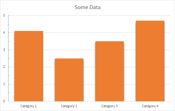
You can see immediately that this graph gives you a clear picture of which category is largest and which is smallest. It gives a clear comparison between categories.
You can also use the graph to read off information about how many are in each category without having to refer back to the data table, which may or may not be provided with every graph you see.
In general, you can draw bar graphs with the bars either horizontal or vertical, because it doesn’t make any difference. The bars do not touch.
A histogram is a specific type of bar chart, where the categories are ranges of numbers. Histograms therefore show combined continuous data.
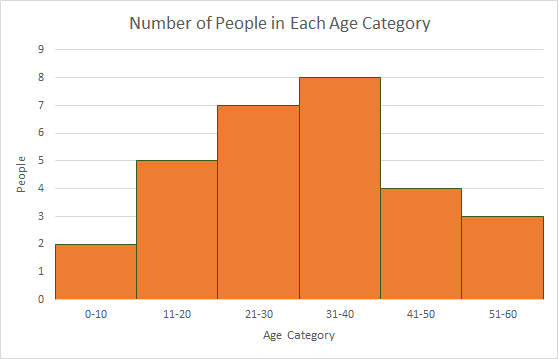
Histogram - Worked Example
You have been given a list of ages in years, and you need to show them in a graph.
The ages are:
5, 12, 23, 22, 28, 17, 11, 21, 25, 23, 7, 16, 13, 39, 35, 42, 24, 31, 35, 36, 35, 34, 37, 44, 51, 53, 46, 45, and 57.
You can choose to group them into ten-year age categories, 0–10, 11–20, 21–30 and so on:
| Age | Number of people |
| 0-10 | 2 |
| 11-20 | 5 |
| 21-30 | 7 |
| 31-40 | 8 |
| 41-50 | 4 |
| 51-60 | 3 |
To show this data in a histogram, your x-axis would be numbered in 10s from 0 to your highest age, your y-axis from 0 to 8 (the highest number of people in any group), and there would be no gaps between the bars, because there are no gaps between the age ranges.
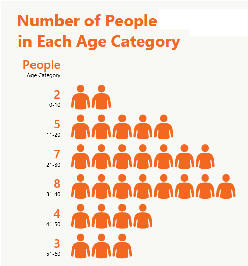
Pictograms
A pictogram is a special type of bar graph. Instead of using an axis with numbers, it uses pictures to represent a particular number of items. For example, you could use a pictogram for the data above about ages, with an image of a person to show the number of people in each category:
Pie Charts
A pie chart looks like a circle (or a pie) cut up into segments. Pie charts are used to show how the whole breaks down into parts.
For example, this data shows the sales figures for a year, broken down by quarters:
| Quarterly Sales Figures | 1st Qtr | 2nd Qtr | 3rd Qtr | 4th Qtr |
| 8.2 | 3.2 | 1.4 | 1.2 |
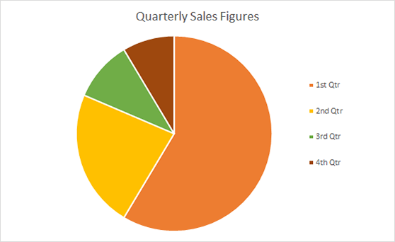
From the pie chart you can see immediately that sales in Quarter 1 were much bigger than all the others: more than 50% of total annual sales.
Quarter 2 was next, with around 25% of sales.
Without knowing anything more about this business, you might be concerned about the way that sales appeared to have dropped over the year.
Pie charts, unlike bar graphs, show dependent data.
The total sales in the year must have to have occurred in one quarter or another. If you’ve got the figures wrong, and Q1 should be smaller, one of the other quarters will have sales added to compensate, assuming that you haven’t made a mistake with the total.
Pie charts show percentages of a whole - your total is therefore 100% and the segments of the pie chart are proportionally sized to represent the percentage of the total. For more on percentages see our page: Introduction to Percentages.
Usually it is not appropriate to use pie charts for more than 5 or 6 different categories. Lots of segments are difficult to visualise and such data may be better displayed on a different type of chart or graph.
Line Graphs
Line graphs are usually used to show dependent data, and particularly trends over time.
Line graphs depict a point value for each category, which are joined in a line. We can use the data from the pie chart as a line graph too.
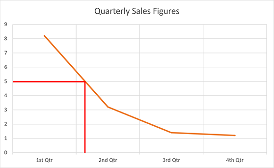
You can see even more obviously that sales have fallen rapidly over the year, although the slow-down is levelling out at the end of the year. Line graphs are particularly useful for identifying the point in time at which a certain level of sales, revenue (or whatever the y value represents) was reached.
In the example above, suppose we want to know during which quarter sales first fell below 5. We can draw a line across from 5 on the y-axis (red line on the example), and see that it was during quarter 2.
Cartesian Graphs
Cartesian graphs are what mathematicians really mean when they talk about graphs. They compare two sets of numbers, one of which is plotted on the x-axis and one on the y-axis. The numbers can be written as Cartesian coordinates, which look like (x,y), where x is the number read from the x-axis, and y the number from the y-axis.
Warning!
Cartesian graphs do not always start at 0; quite often (0,0) is the mid-point of the graph.
Cartesian Graph - Worked Example
John is two years older than Mary, and their ages added together equal 12. What age are they both now?
We can solve this by drawing two lines, one of John’s age compared with Mary’s, and one of the ages that add together to give 12.
Line 1: John’s (actual) age when Mary is different ages between 1 and 9
| Mary's Age | 1 | 2 | 3 | 4 | 5 | 6 | 7 | 8 | 9 |
| John's Age (=Mary + 2) |
3 | 4 | 5 | 6 | 7 | 8 | 9 | 10 | 11 |
Line 2: John’s (hypothetical) age when Mary is different ages between 1 and 9 if their ages add up to 12
| Mary's Age | 1 | 2 | 3 | 4 | 5 | 6 | 7 | 8 | 9 |
| John's Age (=12 - Mary's Age) |
11 | 10 | 9 | 8 | 7 | 6 | 5 | 4 | 3 |
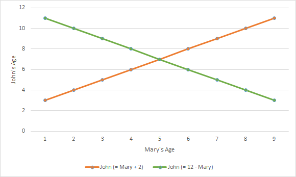
Plotting the two lines on graph, with Mary’s age as the x-axis, you can see that there is a point at which the lines cross. This is the only point at which a) John is two years older than Mary and b) their ages add up to 12. This must be their current ages, which are therefore 5 for Mary and 7 for John.
For more about the uses of Cartesian graphs to solve problems in maths, take a look at our pages on Algebra and Simultaneous and Quadratic Equations.
Drawing Graphs using Computer Packages
You can use various computer software packages, including Word and Excel, to draw graphs.
Some packages are extremely capable when used effectively. However, be aware that some applications are rather limited in the type of charts that they can draw, and you may not find the results entirely what you expected! You really need a basic understanding of graphs and charts so that you can compare what the computer has created to what you want to show.
Computer applications also make it easy to produce overly-complicated graphs. A 3D exploding pie chart may look 'cool' but does it help you or others to visualise the data? It is often best to keep graphs and charts simple with neat, clear formatting.
Further Reading from Skills You Need
Data Handling and Algebra
Part of The Skills You Need Guide to Numeracy
This eBook covers the basics of data handling, data visualisation, basic statistical analysis and algebra. The book contains plenty of worked examples to improve understanding as well as real-world examples to show you how these concepts are useful.
Whether you want to brush up on your basics, or help your children with their learning, this is the book for you.
A Graph is Worth…
However you choose to present your data, once you have mastered the skills of producing clear graphs and charts, you will almost certainly find that the old saying is right: a picture really can tell a thousand words.
Whether your well-drawn graph is worth a thousand numbers or a dozen, it will certainly be an effective way of presenting your data and demonstrating the relationships or differences between them.
Continue to:
Research Methods
Presenting Data